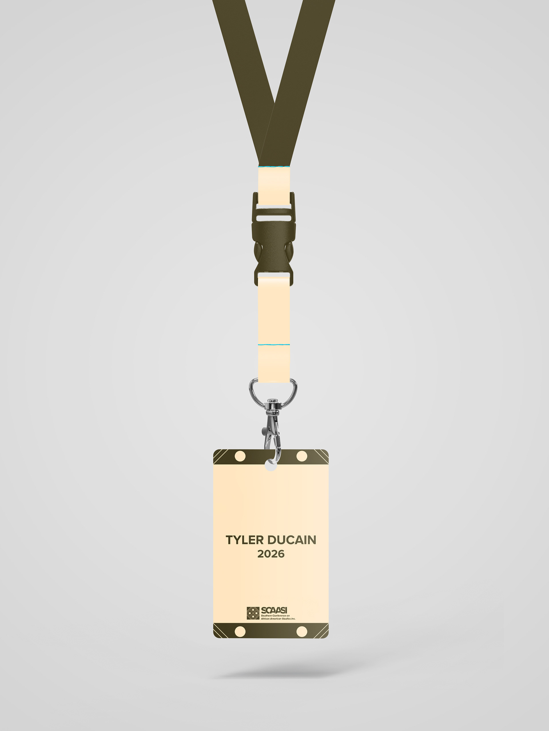
Brand Touch Points: SCAASI
The brand touchpoints extend the identity into physical and experiential applications, including conference materials and merchandise. Graphic elements such as lines and dots were intentionally retained from the logo system to create strong visual continuity across touchpoints. These repeated motifs ensure that all materials clearly tie back to the core identity, reinforcing brand recognition and cohesion throughout the user experience.

Brand Guidelines: SCAASI Redesign
The brand guidelines establish a cohesive system that governs logo usage, typography, color palette, and imagery across print and digital applications for the SCAASI brand. Designed to ensure consistency and longevity, the guidelines provide a flexible framework that allows the brand to adapt across academic, conference, and promotional materials while maintaining a unified and recognizable visual identity.

SCAASI Logo Redesign
The logo redesign for the Southern Conference on African American Studies, Inc. (SCAASI) was developed to honor the organization’s original identity while introducing a more contemporary visual language. Select original brand colors were retained to preserve continuity with the existing logo, while the concept draws inspiration from West African symbolism. A West African cloth pattern was incorporated into the mark to represent knowledge, history, and cultural transmission, reinforcing SCAASI’s mission of scholarship and intellectual exchange.

Academic Journal Redesign: The Griot
This project involved redesigning The Griot, an academic journal, with a focus on creating a cohesive yet engaging publication system. The layout emphasizes strong grid structure and thoughtful pacing while incorporating imagery directly related to the text to reinforce meaning. A varied but intentional use of color was applied throughout the publication to maintain visual interest, guide readers through the content, and keep lengthy academic material engaging without sacrificing clarity or readability.
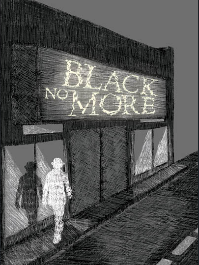
Black No More Book Cover Redesign
This project involved redesigning the paperback book cover and dust jacket for Black No More with typography and imagery working together to reflect the novel’s themes of race, identity, and transformation. The cover references the recurring contrast between Black and white social spaces—such as clubs and nightlife—as the main character changes his race to white. A white silhouette represents his physical transformation, while a Black reflection in fractured glass symbolizes the persistence of his Black identity beneath the surface, emphasizing that despite the external change, his internal and genetic identity remains unchanged.

Display Typeface
This project focused on designing a custom display typeface inspired by an existing typeface and the novel Black No More by George S. Schuyler. The typeface was developed to reflect the main character’s internal conflict with self-identity and transformation, using fractured, broken-glass–like forms to suggest distortion and the experience of seeing multiple versions of oneself. The final typeface was presented as a cohesive visual system through a typographic specimen poster that highlights its conceptual, structural, and narrative influences.

Panthers FIGHT! Against Human Trafficking
Panthers FIGHT! is a design activism campaign created to raise awareness about human trafficking within the Prairie View A&M University student body. The project includes two coordinated posters, social media content, and a proposed awareness event, designed as a cohesive visual system using a modular grid and clear typographic hierarchy. One poster focuses on the emotional impact of human trafficking, while the other educates students on how to recognize warning signs and take action.
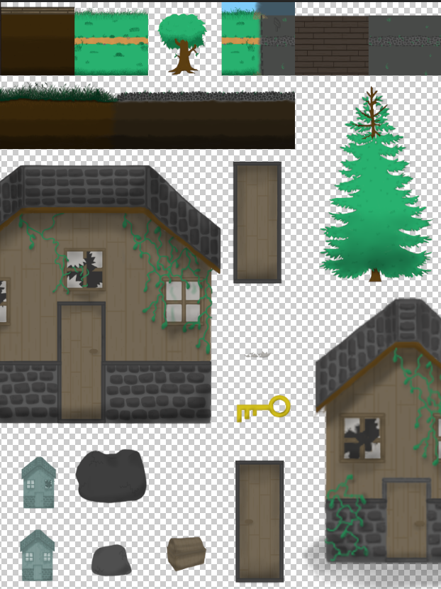
2D Video Game Tile Maps
Zoo Directional Signs

Jennifier's Heaven Business Card

Revive Poster
The original image is taken from the aftermath of the Tulsa Race Massacre. I collaged in newer buildings and a man, which can be differentiated by the difference in saturation. The image is depicting a young man walking through the destroyed town and envisioning rebuilding architecture that still has the same essence of the buildings and the people that were once there.

Self Expression Poster

3D Broken Walkman Model Render
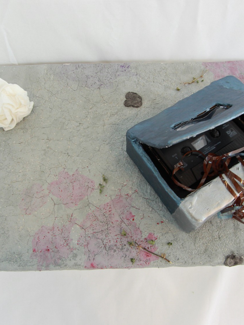
3D Broken Walkman Model

Audrey Mika Tour Poster
Audrey Mika is a smaller alternative/pop artist. All the visual elements in the poster reflects different parts of her artistry.

Regulation
This is a movie poster I created for the short film Regulation.
https://www.regulationfilm.com/

Siggraph spacetime poster
"The design for the poster had to relate to the mission of SIGGRAPH and for this year’s edition it was recommended to entrants that they design around the 2025 conference theme, “Immersive Futures, Blending Realities,” looking at how these blended realities can enrich our lives and foster deeper connection with nature."
This work is also shown in honorable mentions of Siggraph's 2025 art gallery.
https://education.siggraph.org/wp/spacetime/gallery-2025/